

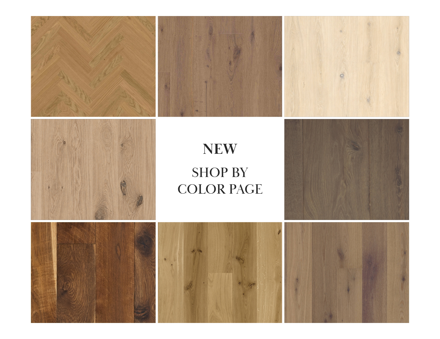
Ever walked into a room and instantly felt calmer because of the floor beneath you? Or found yourself drawn to a warm honey-toned plank before you even registered the species or the finish? That’s not a coincidence — it’s neuroscience. And it’s exactly why we’re excited to introduce something new at VANTIA: our Shop by Color page.
The Feature, in a Nutshell
Instead of digging through collections one at a time, you can now browse our entire hardwood catalog the way your brain actually prefers to work: by color first. Tap a swatch — say, a warm terra brown, a cool misty grey, or a rich chestnut — and watch the page fill with every plank we carry in that family, pulled from across our in-stock and special-order lines alike. It’s a faster, more intuitive way to find a floor you’ll fall in love with.
Why Color Comes First (According to Your Brain)
Here’s the fun part. Long before we process a product’s name or specs, our brains have already reacted to its color. Visual neuroscience research suggests color information reaches the brain in a matter of milliseconds — faster than we consciously register shape or detail. Color isn’t decoration; it’s often the very first data point we use to decide whether we like something, whether it’s a plank of oak or a coat of paint.
That’s especially true with flooring, where color does more work than almost any other design choice in a room. It’s the largest surface most people see at once, and it sets the emotional tone before anyone notices the grain, the width, or the finish.
Color and Emotion, One Plank at a Time
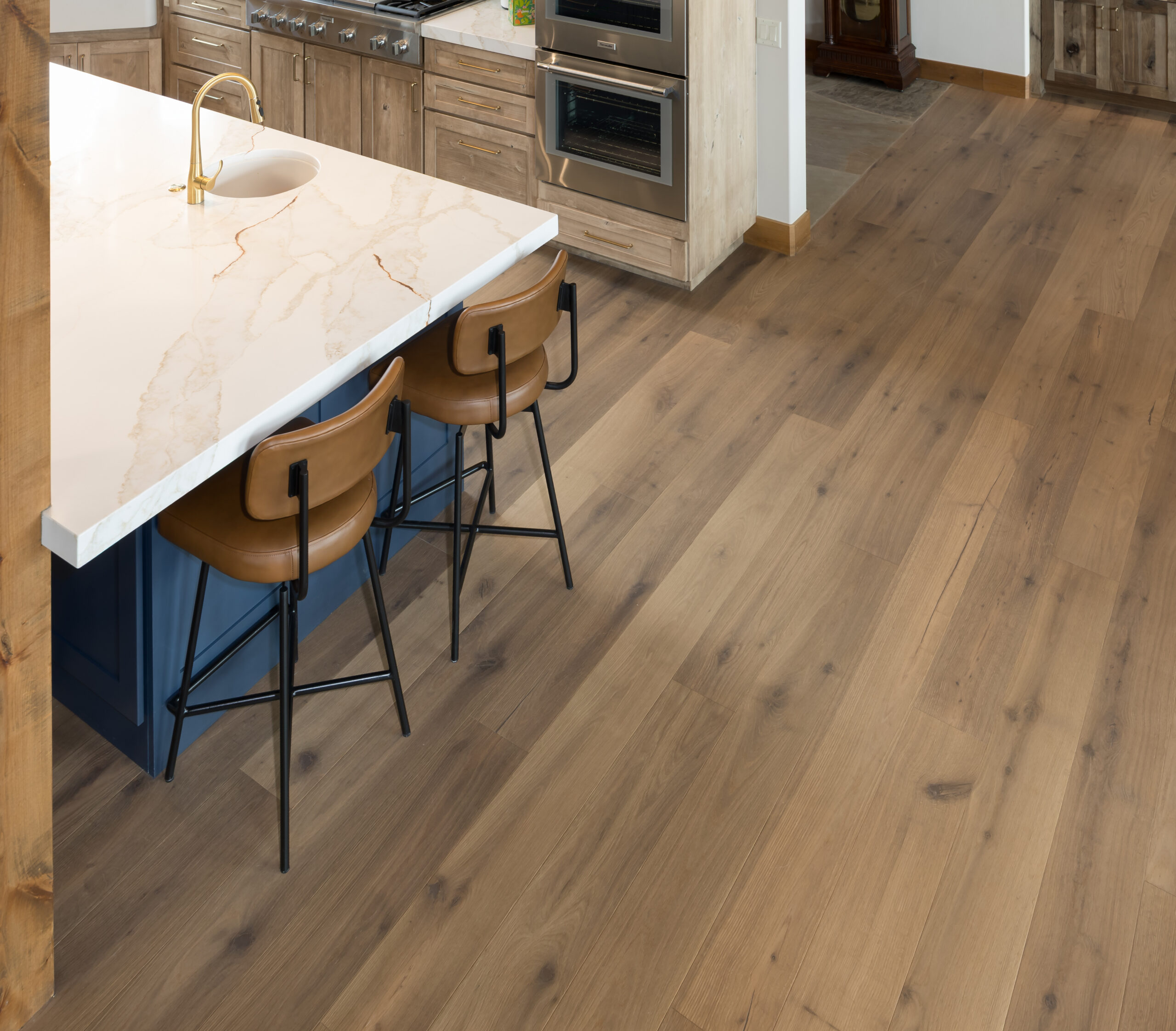
Take our Peak Collection, inspired by the mountains of Colorado and in stock. Its Copper, Sopris, and Ouray tones are achieved through steaming and smoking European oak — a process that pushes color all the way through the wear layer, producing warm, layered earth tones with a rustic, lived-in character. Choosing between them isn’t just picking a shade; it’s choosing a mood for the room.
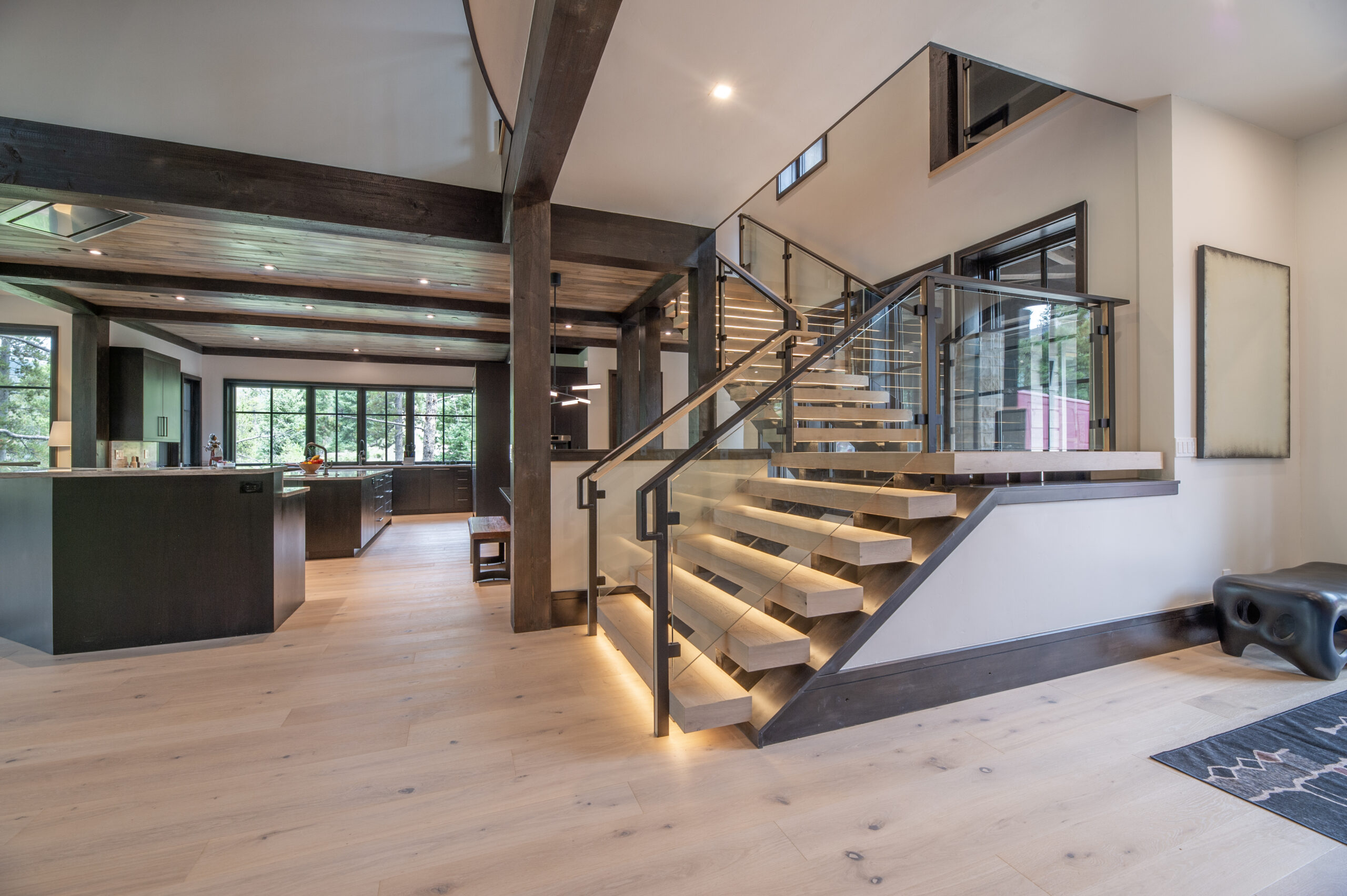
Our Classic Collection leans the other direction — six colors of European white oak, from the pale, airy Bianca to the warmer, grey-beige Perla and Natura, plus the newer Avoria and Sepia. These lighter, more neutral tones tend to read as calm and expansive, which is part of why so many people gravitate toward them for open, light-filled spaces.
Then there’s Bjelin Woodura, our line of hardened wood floors engineered in Sweden for serious durability. The color story here ranges from Powder White Oak and Misty White Oak to deeper options like Earth Grey and Terra Brown, across oak, ash, and walnut. Whether you’re drawn to a soft Scandinavian palette or something richer and earthier, Woodura proves that a color decision doesn’t have to come at the expense of performance.
Beyond the Shelf: Color as a Story

Once you step into our special-order collections, color starts to carry even more narrative weight. The Scheucher Elevation Collection names every shade after an island — Sansibar’s pale, sun-bleached tones, Kuba’s deep reds and browns drawn from clay paths and tobacco fields, Rügen’s cliffside greys. Each color was developed to evoke a specific place, so picking a plank here is a little like picking a destination.
Arbony, our French Oak line handcrafted in Belgium, achieves its colors through natural oxidation rather than staining, reacting with the wood’s tannins. That process alone spans a wide emotional range — from the soft, aged Chestnut and Natural tones of the Campagne Collection, to the moody Anthracite and Dark Grey of Manoir, to the clean, contemporary Light Grey and Cognac Light of Residence. It’s proof that even “neutral” wood tones carry real personality once you look closely.
And for something with even more history behind it, our Reclaimed Flooring — milled from century-old barns and industrial buildings — brings colors and textures that simply can’t be manufactured on purpose. Original nail holes, saw marks, and decades of natural patina mean every color variation is one-of-a-kind, telling a story most new wood never gets the chance to.
The Joy of Choosing (Without the Overwhelm)
There’s a well-documented idea in psychology called the paradox of choice — too many options can actually make decisions harder, not easier, and leave us less satisfied with what we pick. With six collections, dozens of colors, and multiple finishes and species across our catalog, that risk is real.
Color is one of the fastest, most intuitive filters your brain already knows how to use. By letting you shop through color first — rather than starting with collection names or technical specs — we’re cutting the cognitive load way down. You don’t need to know the difference between a Woodura core and an engineered wear layer to know you love that warm, honeyed tone. Start there. The details can follow.
A Page Built for Browsing, Not Just Buying

We built Shop by Color to feel less like a filter and more like a mood board — something you can scroll through the way you’d flip through paint swatches, discovering a Peak Collection Ouray sitting right next to an Elevation Kuba because they simply share a palette, even though they come from entirely different corners of our catalog. Sometimes you’ll land on exactly the plank you came for. Other times, the color will lead you somewhere you didn’t expect.
So next time you’re not sure where to start, skip the collection names. Just follow the color. Your brain — and your floor — will thank you.